
Telling the right story.
The world of Democracy Fund’s fifth birthday was radically different than the one it was first created in. Our challenge was to update Democracy Fund’s brand and identity to better reflect what the organization had become — one that stands up for an open and just democracy — and established a clear system for consistency across all channels.
From optimistic to determined.
When it comes to American democracy, 2018 was a much different year than 2014. Our challenges were bigger than ever — mis- and disinformation, challenges to election security, a breakdown in systems of governance, and more. Democracy Fund, as an organization, was well equipped for this moment; it had the staff and resources necessary to rise to the moment. But its brand was a step behind, it was too cheerful, too youthful, too Silicon Valley, and too naïvely hopeful. Through an inclusive process over four months that engaged internal and external stakeholders — through surveys, workshops, and gallery walks — we clarified key brand attributes. The first breakthrough we had was the biggest: We would shift our brand personality from a position of “optimism” to one of “determination.”
High impact evolution.
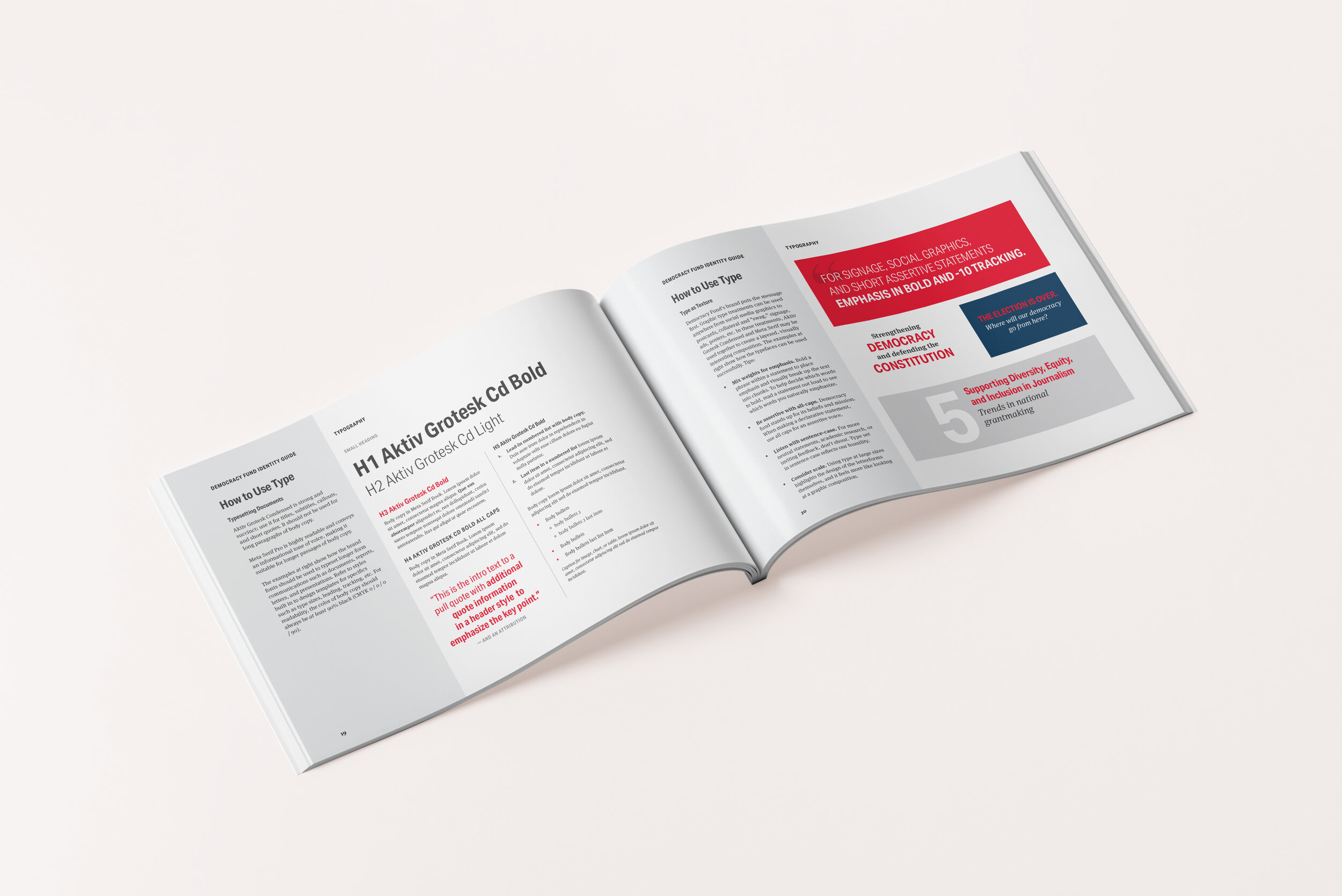
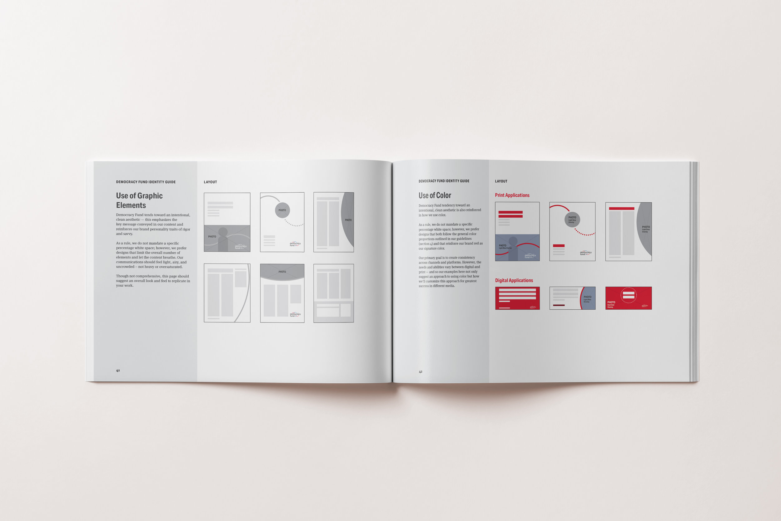
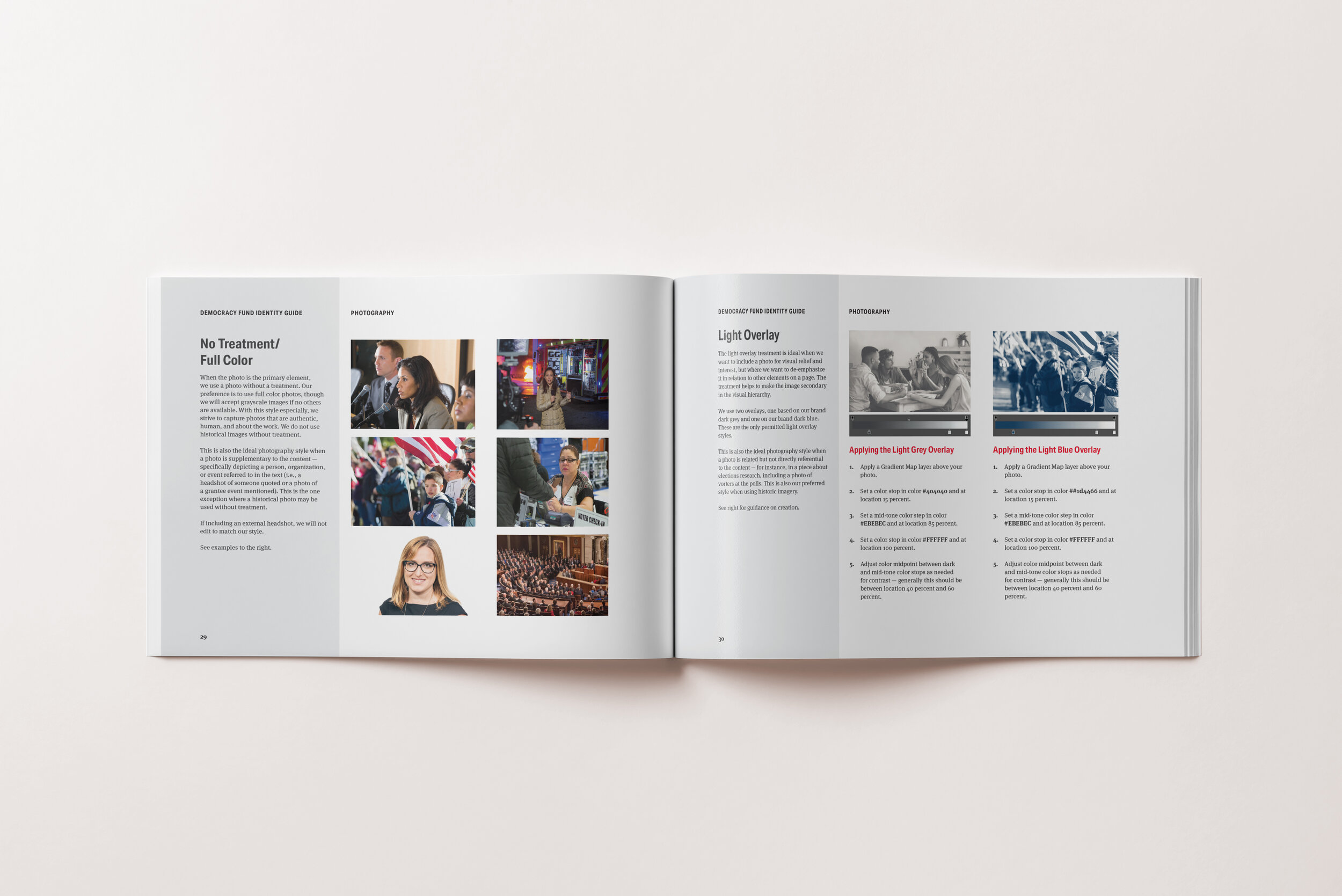
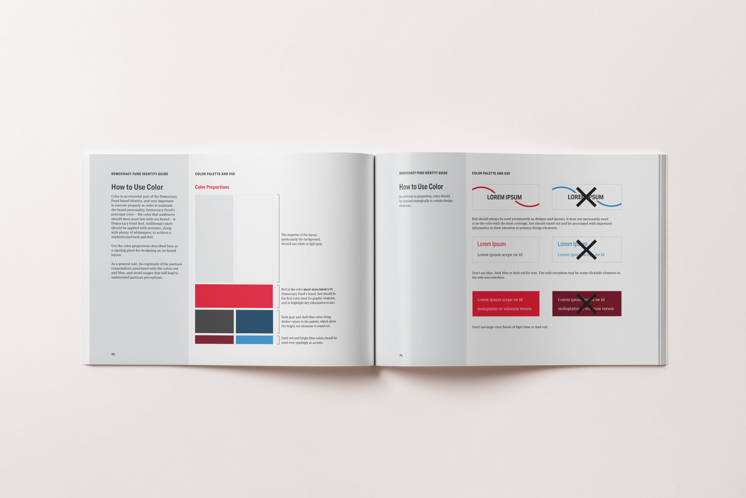
In conversation with stakeholders, our guidance was to change as little as possible and only as much as was needed to convey the key changes to our brand personality. We focused primarily on narrowing, codifying, and strengthening. We changed from a modern geometric sans serif to a condensed grotesk font supported by a serif body font. We narrowed the color palette radically, dropping the brightest colors and promoting dark and more serious colors to the fore. We narrowed and provided much clearer guidance on the use of imagery, dropping the use of highly-posed stock photography in exchange for more organic imagery. And we introduced new graphic elements based on the logo, which stayed the same. The result was a clarified brand personality and a significantly expanded and updated visual identity guide. Designers have a clear structure from which to build solid design solutions, fully aligned with the brand. This has led to quicker design turnaround, increased productivity, and expanded reach of work.


“This new identity guide has made it easier to get more stuff done on-brand — and to make sure everything we do reaches and grabs our audience of change-makers.”
— Democracy Fund Senior Communications Associate
Tell a consistent story.
Alongside our work to revise and update Democracy Fund’s visual identity, we undertook a process to refine Democracy Fund’s brand tone and voice. Alongside partners from Atlantic 57 and Williams Group, we did a deep dive with stakeholders (both internally and externally) to understand how Democracy Fund is perceived, where our current position was holding us back, and what gaps exist in the field. What we heard time and time again was that we had been successful at positioning Democracy Fund as a bipartisan convener, but our audiences didn’t have a clear understanding of our values. Our key breakthrough was a new effort to focus Democracy Fund as standing for “an open and just democracy” rather than centering on our approach. In order to ensure consistency across channels, we developed a number of tools, including an updated tone and voice guide for staff, updated boilerplate, and updated manual of style.
Roles
Brand strategy, Art direction, Design
Team
Abby Holcomb — Design
Jason Divozzo — Strategic Communications
Anna Kegler — Copywriting